There's a variety of Field types and other children you can define on Documents.
Standardized Fields
The docs below will reference "standardized" fields. A goal of ISDL is that you shouldn't have to remember what fields do what for standard features. All fields now meet this goal.
Standard Parameters
Standardized fields support the following parameters:
- The
iconparameter, to set an Font Awesome icon - The
colorparameter, which is used in replacement of the user's primary color choice - The
labelparameter, which overrides the English localization for the label - The
theme:parameter, to override the system theme for just this field (e.g.attribute Luck(theme: { primary: #8b1e1e })). See Theming & Styles. Every field also emits stable CSS classes (.isdl-field-<name>and a per-type class) you can target from a sidecar stylesheet — see the CSS Class Reference. - Visibility, via either a modifier on the field such as
gmOnly string Thingor via thevisibilityparam, which can return either a visibility or a method that calculates a visibility. - Additionally, all number-based fields such as Number, Attribute, Resource, and Tracker support the following:
min- The minimum valueinitial- The initial value at create timevalue- If set, this will made the field "calculated", always resulting in this value. The user and AE's will be unable to edit it.max- The maxium value
- String and Boolean also accept a
valueparameter
Visibility, when set via the parameter, can be calculated to allow for complex Visibility rules. For instance, you may want to only display a field if the user is a certain class.
choice<string> HeroType(choices: ["Tank", "Mage", "Rogue"])
tracker Mana(visibility: {
    if (self.HeroType equals "Mage") return Visibility.default
    return Visibility.hidden
})
Visiblity.default will use the standard visibility rules - displayed for all, only editable in EditMode. If nothing is returned, Visibility.default is the assumed value:
choice<string> HeroType(choices: ["Tank", "Mage", "Rogue"])
tracker Mana(visibility: {
    if (self.HeroType !equals "Mage") return Visibility.hidden
    // Will assume Default visibility
})
Another common pattern is disabling an Action when it's not valid to be run:
action Refill(icon: "fa-duotone fa-solid fa-sparkles", visibility: {
    if (self.Mana equals self.Mana.Max) return Visibility.locked
    })
{
    self.Mana = self.Mana.Max
}
Visibility Shorthand Prefixes
Any field or action can be tagged with a static visibility by writing the visibility name before the field's keyword. The same nine names that appear as Visibility.X values can be used as prefixes:
gmOnly string SecretNote          // Hidden from players
secret resource Treasure           // GMs/Owners can edit, viewers can't see
hidden number InternalCounter      // Not rendered on the sheet at all
unlocked tracker Mana              // Always editable, even outside Edit Mode
locked number CalculatedScore      // Read-only for everyone
edit string DesignerNote           // Only visible in Edit Mode
play action Strike                 // Only available in Play Mode
gmEdit string GMNote               // Owner reads, GM edits
readonly number Tally              // Read-only display
The full list is unlocked, default, secret, edit, play, gmEdit, gmOnly, readonly, locked, hidden. See the table below for what each one allows.
For conditional visibility (e.g., hide an action when out of charges), use the visibility: parameter with a method block instead — see "Combining a shorthand prefix with conditional logic" further down.
Visibility Tags
Here's a handy chart about visibility & permissions.
| Syntax | GM | Owner | Viewer | Active Effects |
|---|---|---|---|---|
| unlocked | ✅Always Read / Write | ✅Always Read / Write | 👁️Read | ✅Can edit |
| default (no tag) | 📝Read / Write based on edit mode | 📝Read / Write based on edit mode | 👁️Read | ✅Can edit |
| secret | 📝Read / Write based on edit mode | 📝Read / Write based on edit mode | ❌Can't see | ✅Can edit |
| edit | 📝Read / Write only in edit mode | 📝Read / Write only in edit mode | 👁️Read only in edit mode | ✅Can edit |
| play | 📝Read / Write only in play mode | 📝Read / Write only in play mode | 👁️Read only in play mode | ✅Can edit |
| gmEdit | 📝Read / Write based on edit mode | 👁️Read | 👁️Read | 🧙GM's making AE's can edit |
| gmOnly | 📝Read / Write based on edit mode | ❌Can't see | ❌Can't see | 🧙GM's making AE's can edit |
| locked (also calculated) | 👁️Read | 👁️Read | 👁️Read | ❌Can not edit |
| hidden | ❌Can't see | ❌Can't see | ❌Can't see | ✅Can edit |
Combining a shorthand prefix with conditional logic
Visibility shorthand prefixes (gmOnly, secret, hidden, etc.) are static — once written, they always apply. To make visibility conditional on a field's state, use the visibility: parameter with a method block instead. The block returns a Visibility.X value:
// Hide the action when there's no healing available
action Heal(visibility: {
    if (!self.HasHealing) return Visibility.hidden
    // Falling through with no return uses Visibility.default
}) { . . . }

// Lock (disable) the action when at full Mana
action Refill(visibility: {
    if (self.Mana equals self.Mana.max) return Visibility.locked
}) {
    self.Mana = self.Mana.max
}
Standardized fields also allow the current value of the field to be calculated, making it implicitly locked
Fields Summary
Simple Fields
These fields map to standard Foundry schema fields, and with enough effort you could build a system using mostly these.
| Field | Datatype | Summary |
|---|---|---|
| boolean | Boolean | Use to store simple yes / no values, such as "Equipped" or "Has Magic". Useful for showing / hiding other fields. |
| number | Number | A basic number field that can be optionally bounded with a min / max, or calculated. Use for currency, amounts, total weight, experience, bonuses, etc. |
| string | String | A basic unformatted single-line textfield. Supports a list of choices. Use for summaries, triggers, simple info, or lists of choices like "Physical" vs "Magic". |
| choice<string> | String | A dropdown field with predefined string choices and enhanced metadata support. Use for categorization with visual styling. |
| choice<damageType> | String | A specialized damage type field that auto-generates Active Effects fields and integrates with the damage() function (WIP). |
| html | HTML | A multi-line formatted text block. Use for Effects, biographies, etc. |
| date | String | Use to store a realworld date, such as "advancement granted" etc. |
| time | String | Use to store a realworld time, such as "last used" etc. |
| datetime | String | Use to store a realworld date & time, such as "advancement granted" etc. |
| image | String | A click-to-edit image with a file picker. Stores its own path by default; mark one primary: true to bind the document's portrait/token image and place it anywhere in the layout. |
Common Building Blocks
To speed up building and enable certain Foundry features such as Resource bars, these fields wrap common TTRPG concepts and pairs them with ISDL built-in and native Foundry functionality.
| Field | Datatype | Summary |
|---|---|---|
| resource | Complex | A special number that wires up resource bars for Tokens and supports "Temporary" values that get removed first. Works with damage application. Use for Health, Mana, Armor, etc. |
| attribute | Complex | A special number that calculates a mod value. Use for attribute scores. |
| tracker | Complex | A slimmer version of Resources that support Temporary values and a variety of visual styles. Use for Mana, Shields, Gauges, etc. |
| damageTrack | Complex | A World of Darkness–style damage track with named severity buckets (e.g. bashing/lethal/aggravated). Click to fill, right-click to heal. |
| money | Complex | Stores currency with support for both single currency and multi-denomination systems. Includes automatic formatting, currency conversion, and calculator support. Use for Gold/Silver/Bronze, Credits, etc. |
| measuredTemplate | Complex | Stores Foundry VTT measured template data for spells and abilities that create areas of effect. |
| die | String | Stores a single die value (d4, d6, d8, etc.) with die step operations. Use for damage dice, skill dice, etc. |
| dice | String | Stores a number of dice and a size such as "2d6". Use for attack rolls, damage formulas, etc. |
Document Links / Embeds
It's common to want an Document to own or link to other Documents - usually Items, but sometimes other Actors as well. These fields set that up and allow you to "include" that other document's data in this one.
| Field | Datatype | Summary |
|---|---|---|
| Item List | Embedded array of Item | Stores a list of Items on this Actor. Use for owned Equipment, Spells, Features, etc. |
| Document Link | UUID | Links to a single Document via drag & drop. Use for "chosen spell", "equipped helmet", etc. |
| Parent Field | String | Allows a user to pick a field, such as a Resource or Attribute, on the Parent document. Use for Attack Mod setup, resource spent on use, etc. |
| Self Field | String | Allows a user to pick a field on the current document. Use for dynamic stat selection, configurable damage types, etc. |
| Document Choice | UUID | Links to a single Document via a searchable dropdown. Use for "chosen spell", "equipped helmet", etc. |
| Document Choices | Array of UUID | Links to multiple Documents via a searchable dropdown. Use for "chosen features", "equipped armor", etc. |
| Paperdoll | Object of UUID | Links to multiple Documents via a set of boxes over an image. Use for "equipped armor" and "equipped weapons", etc. |
| Table Field | Embedded array of Item | Creates a customizable data table for displaying structured information. More flexible than document arrays. |
| Inventory Field | Embedded array of Item | Creates a visual grid-based inventory with drag-and-drop support. Perfect for backpacks, equipment storage, and item management. |
| Macro Field | Complex | Stores a Foundry macro that can be executed. Useful for complex actions or frequently used rolls. |
| Pinned Field | Complex | Creates an interactive table displaying pinned items with all available actions for each item type. Perfect for quick access to favorite or frequently used items. |
| Bonuses | Display | Displays a summary table of all damage type bonuses on this document. Reads from Active Effects fields generated by choice<damageType>. |
| Resistances | Display | Displays a summary table of all damage type resistances (flat and percent) on this document. Reads from Active Effects fields generated by choice<damageType>. |
| Roll Visualizer | Display | Charts the probability distribution, average, and min/max of a dice formula. The formula can reference other fields and the chart updates live as they change. |
Simple Fields
Boolean
boolean <ID> - A basic boolean field, renders as a checkbox. Default of false.
Example:
boolean Slowed
boolean Dazed
A boolean can also be calculated from other fields by providing a value: method block. This makes the boolean read-only (the user can't toggle it) and the value automatically reflects the computed result:
// True whenever Stress hits the breaking point
boolean BreakingPoint(value: {
    return self.Stress >= self.Stress.max
})
Or with a static value:
boolean AlwaysOn(value: true)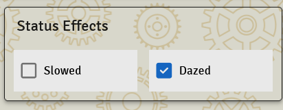
Number
number <ID> - A basic number field, default of 0.
Example:
number Level
Number also supports several optional parameters. Use as many or as few as you would like!
icon- Associates an icon with this propertycolor- When paired withicon, draws the icon in that color.min- Sets the min value this number can be. Computable.initial- Sets the initial value this number will have on creation. A literal number is a true default — applied whenever the value is absent (new docs, resets, imports). It can also be a computed expression (e.g.initial: { return self.MaxStamina }), which is applied once at creation using the document's computed data, so it can referencevalue:fields and other derived values. An expressioninitialonly seeds the field when no value was supplied, so it won't overwrite an explicitly-set value, and it does not re-apply on later updates (usevalue:for a field that should always track a formula).value- Can be set to either a static or computed value. This will result in the base value of this field always being this output, although Active Effects can still modify the base value. Settingvaluewill make the propertyreadonlyfor users. Useful for calculated amounts, such as Defense.max- Sets the max value this number can be. Computable.calculator- Iftrue, shows a calculator icon next to the field that opens an arithmetic dialog (add, subtract, multiply, divide). Automatically shown whenmax > 10. Set tofalseto disable.
Examples:
number Level(min: 1, max: 10, initial: 5, icon: "fa-solid fa-chart-line", color: #FF7F50)
number Defense(value: {
  return self.Fight + self.Flight
})

// Computed initial: ReserveStamina starts equal to MaxStamina at creation,
// then is freely editable (it won't follow MaxStamina afterwards).
number MaxStamina(value: { return self.Endurance + 5 })
number ReserveStamina(initial: { return self.MaxStamina })

// Calculated values can call functions to keep the math reusable.
number Power(value: { return self.BasePower + self.GetPowerBonuses() })
A computed
value:/min:/max:/initial:can call functions, but they must be pure — no rolls, chat, document writes (++/+=/=), or prompts. See Functions in Calculated Values.
String
string <ID> - A basic string field, default of "". Rendered as a text input by default.
Example:
string Summary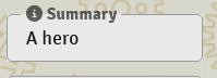
A string can also be restricted to a list of choices, which instead renders as a dropdown.
Example:
choice<string> Type(choices: ["A", "B", "C"])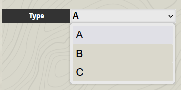
A string can additionally have a calculated value, which makes it readonly
string TestReadout(value: "Test")
string ManaReadout(value: {
    return self.Mana + " Mana left"
})
Choice String
choice<string> <ID> - A specialized dropdown field for string choices with enhanced metadata support including icons, colors, custom labels, and arbitrary additional data.
Example:
choice<string> WeaponType(choices: [
    { value: "Sword", label: "Sword", icon: "fa-solid fa-sword", color: "#C0C0C0" },
    { value: "Bow", label: "Bow", icon: "fa-solid fa-bow-arrow", color: "#8B4513" },
    { value: "Staff", label: "Magic Staff", icon: "fa-solid fa-magic", color: "#9370DB" }
])

choice<string> Training(choices: [
    { value: "Basic", icon: "fa-solid fa-graduation-cap", color: "#FFD700", bonus: 0, checkDC: 16 },
    { value: "Advanced", icon: "fa-solid fa-university", color: "#C0C0C0", bonus: 1, checkDC: 14 },
    { value: "Master", icon: "fa-solid fa-chess-king", color: "#8B4513", bonus: 2, checkDC: 12 }
])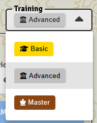
This creates a visually rich dropdown where each option displays with its custom icon and color, and can have a different display label than its stored value. Unlike string fields with choices, choice<string> provides enhanced metadata capabilities.
Additional metadata can be attached to each choice and accessed in logic:
action CastSpell {
    fleeting spellRoll = roll(d20 + self.Level + self.Training.bonus)
    fleeting dc = self.Training.checkDC
    // Use the metadata from the selected choice
}
Parameters:
choices- Array of choice objects with value, label, icon, color, and any custom metadata propertiesicon- Default icon for the fieldcolor- Default color for the field- Arbitrary additional parameters can be attached as metadata
Choices String (multi-select)
choices<string> <ID> - The plural form of choice<string>. Renders as a multi-select where the user can pick several values from the choices list, up to a configurable maximum. Useful for tag systems, "pick 2 of these traits", proficiency lists, etc.
Example:
choices<string> Proficiencies(
    choices: ["Athletics", "Stealth", "Perception", "Persuasion", "Arcana"],
    max: 3
)

choices<string> WeaponTags(
    choices: [
        { value: "Heavy", icon: "fa-solid fa-weight-hanging" },
        { value: "Reach", icon: "fa-solid fa-arrows-left-right" },
        { value: "Loud", icon: "fa-solid fa-volume-high" }
    ],
    max: 5,
    initial: 0
)
The selected values are stored as an array — iterate or check membership in your action logic as you would any list.
Parameters:
choices- Array of allowed values, in the same shape aschoice<string>(plain strings or objects with metadata).max- Maximum number of selections allowed.initial- Number of empty slots to show initially. Default: 0.
Choice DamageType (WIP)
choice<damageType> <ID> - A specialized damage type field that automatically generates Active Effects fields for bonuses and resistances, and integrates seamlessly with the damage() function for typed damage rolls.
Example:
choice<damageType> WeaponDamage(choices: [
    { value: "Slashing", color: "#C0C0C0", icon: "fa-solid fa-sword", physical: true },
    { value: "Piercing", color: "#8B4513", icon: "fa-solid fa-arrow", physical: true },
    { value: "Bludgeoning", color: "#696969", icon: "fa-solid fa-hammer", physical: true }
])

choice<damageType> SpellDamage(choices: [
    { value: "Fire", color: "#FF4500", icon: "fa-solid fa-fire", magical: true, energy: true },
    { value: "Ice", color: "#87CEEB", icon: "fa-solid fa-snowflake", magical: true, energy: true },
    { value: "Necrotic", color: "#800080", icon: "fa-solid fa-skull", magical: true, dark: true }
])
Integration with damage() Function:
action ElementalAttack {
    fleeting attackDamage = damage(roll: 2d8 + self.STR, type: self.SpellDamage)

    // Direct access to choice metadata on damage object
    if (self.Target.hasResistance(attackDamage.type)) {
        attackDamage = attackDamage / 2
    }

    // All choice properties available directly
    if (attackDamage.magical && attackDamage.energy) {
        attackDamage += self.ElementalMastery
    }

    chat AttackResult {
        "Deals " + attackDamage + " " + attackDamage.type + " damage!"
        tag attackDamage.icon
        tag attackDamage.magical
    }
}
Auto-Generated Active Effects Fields: When you define choice<damageType> fields, the system automatically generates corresponding Active Effects fields for bonuses and resistances
Enhanced Features:
- Automatic AE Integration - Generates bonus/resistance fields for all damage types
- Direct Metadata Access - All choice properties accessible on damage objects
- Type Safety - Ensures damage types are consistent across your system
- damage() Function Integration - Seamless integration with typed damage rolls
Parameters:
choices- Array of damage type objects with value, label, icon, color, and custom metadataicon- Default icon for the fieldcolor- Default color for the field
Note: This field type is currently in development and may have limited functionality.
HTML
html <ID> - A richtext formatting field capable of having content links, inline rolls, and text formatting. Renders twice as wide on a sheet as other Properties. Default of ""
Example:
html HtmlField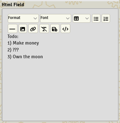
Date, Time, and DateTime
These fields store real-world temporal information for tracking game events and scheduling.
Date Field:date <ID> - Stores a date value for tracking when events occurred.
Example:
date LastAdvancement
date CharacterCreated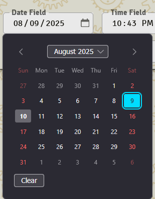
Time Field:time <ID> - Stores a time value for tracking specific times.
Example:
time SessionStartTime
time LastUsed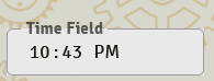
DateTime Field:datetime <ID> - Stores both date and time information.
Example:
datetime LastLogin
datetime SpellCastTime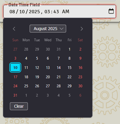
Image
image <ID> - A click-to-edit image. Clicking it (when the sheet is editable) opens Foundry's file picker; the chosen path is saved automatically. Unlike most fields, the path is set through the picker rather than typed.
By default an image field stores its own file path at system.<id>, so you can have as many as you like — a faction crest, an item illustration, a region map, etc.
Example:
image Crest
image RegionMap(icon: "fa-solid fa-map")
The portrait (primary) — mark exactly one image field on a document with primary: true to bind it to the document's built-in portrait / token image (Foundry's native img) instead of a system field:
image Portrait(primary: true)This is how you make the portrait movable: place that field wherever you want in a row, column, or section, and the portrait renders there. When a document has a primary image field, the default portrait in the navigation drawer is automatically hidden so you don't get two. Documents without one keep the drawer portrait exactly as before.
Only one primary image is allowed per document (a second is flagged as an error). A primary image creates no system field of its own — it reads and writes the document's img directly.
Like any field, an image accepts the standard parameters (label, icon, visibility, theme). Because sizing rides the field's theme, you can constrain it — e.g. a compact portrait:
image Portrait(primary: true, theme: { width: { max: 220px } })Common Building Blocks
Resource
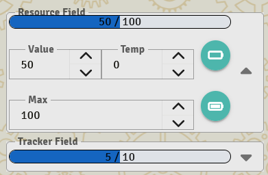
resource <ID>(max: <NUMBER or METHOD>) - A fancier version of number, this generates a current, temp, and max field. Renders with an animated bar based on how full the resource is.
Automatic clamping. When the sheet is in Play mode, you don't need to worry about going over max or under min. ISDL automatically pulls the value back into range right after your action runs and again every time the sheet refreshes. So this is fine:
action Heal {
    self.HP += 100        // Even if this would exceed max, ISDL clamps it back down for you
}
If you need the post-clamp value inside the same action — for example, to calculate "how much overheal got wasted" — you can clamp the value yourself before reading it again:
action Heal {
    self.HP += 100
    if (self.HP > self.HP.max) {
        self.HP = self.HP.max
    }
    fleeting overhealed = self.HP.max - self.HP   // Now reads the clamped value
}
In Edit mode (when a user is editing the sheet structure), clamping is intentionally not applied so you can temporarily set values outside the configured range while reconfiguring.
min defaults to allowing negative values (no floor) unless you set one.
Example: resource ResourceField
A method can also be provided to calculate the max based on other attributes:
number Warrior
resource Fate(max: {
    return self.Warrior + 6
})
When subtracting from the Resource, temp amounts are automatically removed first. 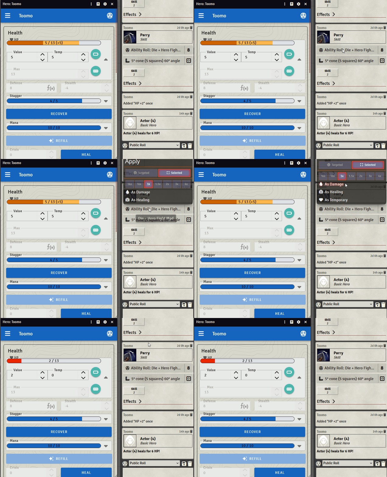
color Can be set to customize the coloring of the box:
resource Fate(color: #FFF)health or wounds marks this resource as the primary one for keeping track of health. This is restricted to one instance per document. Both will do the following:
- The resource will use a custom red (low) to green (high) resource bar render
- The resource will become the automatic bar1 resource on Tokens, unless token defaults are setup otherwise
- Changes to this resource will cause dynamic token rings to flash
- The resource is what will be modified by the Damage Applicator
health resource Health(max: {
    return self.Warrior + 6 + self.HealthMod
})
The companion tag wounds is a visual sibling of health for systems where characters accumulate harm rather than lose health (Year Zero "Damage", Forged in the Dark "Stress", etc.). The bar uses a blue/teal gradient where empty is "fine" and full is "in trouble":
wounds resource Stress(max: 9)Note
wounds currently affects only the visual presentation of the resource bar. The damage applicator does not automatically route incoming damage to a wounds resource — it always targets a health resource. If you want incoming damage to increase a wounds-style pool, wire that up yourself in your action code (or via a preApplyDamage hook).
Attribute
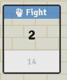
attribute <ID>(min: <NUMBER or METHOD>, max: <NUMBER or METHOD>, mod: <METHOD>) - An input number is used to derive a more useful mod number that becomes the default value referenced. It can reference its own base input number.
mod: is optional. If you don't provide one, the attribute's mod defaults to its own value — perfect for systems like PbtA, Forged in the Dark, or Year Zero where the stat is the modifier with no separate "score":
// PbtA-style: stat range -1..+3, no separate score, no mod calculation needed
attribute Bold(min: -1, max: 3)
attribute Cunning(min: -1, max: 3)
Provide mod: when your system has a score-vs-modifier split (D&D-style):
// D&D-style: 1-30 score, derived modifier
attribute Strength(min: 1, max: 30, mod: {
    return (self.Strength - 10) / 2
})
When you reference an attribute in a roll or expression — e.g. roll(2d6 + self.Bold) — ISDL substitutes the mod value, not the raw value. This is true whether mod: is custom or defaulted.
Additional parameters:
style:— Visual presentation. One ofplain(the value displayed inline) orbox(the value displayed in a boxed cell). Default:box.roll:— Bakes a default roll formula into the attribute. When set, a roll button is rendered alongside the attribute on the sheet that executes this formula. Saves you from defining a separateactionfor the common "roll this stat" case.
attribute Brain(min: 1, max: 10, roll: roll(d20 + self.Brain))
attribute Cunning(min: -1, max: 3, style: plain)
The roll: value can be a single roll(...) expression, or a full method block if you need branching:
attribute Wits(min: -1, max: 3, roll: {
    fleeting result = roll(2d6 + self.Wits)
    chat witsRoll {
        flavor "Wits check"
        result
    }
})function:— Runs a function when the attribute is clicked, for full control over what happens. Use this instead ofroll:when "roll this stat" isn't enough — multiple rolls, a prompt, conditional chat, or updating fields on the document. Likeroll:, a clickable overlay is rendered on the attribute; it shows the attribute's own icon rather than a die.
function PowerStrike {
    fleeting attack = roll(d20 + self.Might)
    self.Stamina -= 1
    chat PowerStrikeCard {
        flavor "Power Strike! (" + self.Stamina + " stamina left)"
        attack
    }
}

attribute Might(min: 1, max: 30, icon: "fa-solid fa-hand-fist", function: PowerStrike)
The referenced function must take no required parameters (the click invokes it with no arguments), and must be defined on the same document. roll: and function: are mutually exclusive — set one or the other, not both.
Tracker
tracker <ID>(max: <NUMBER or METHOD>) - A slimmed-down version of resource that supports temporary values and multiple visual styles. Perfect for secondary resources like mana, shields, or special abilities.
Example:
number MagicSkill
tracker Mana(max: {
    return self.MagicSkill * 2
}, style: segmented, segments: 10)
Supported styles:
bar(default) - Shows as a progress bar like resources
segmented- Shows as individual segments/boxes
icons- Shows as filled / empty font awesome icons
slashes- Shows as filled / empty slashes
dial- Shows as a semi-filled circle. This style unfortunately doesn't support a rendering oftemp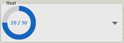
clock- A segmented clock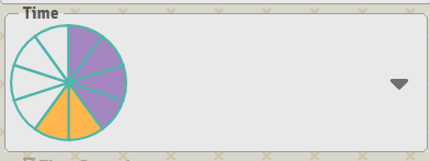
plain- It's... a number!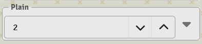
Parameters:
max- Maximum valuestyle- Visual stylesegments- Number of segments to render. Most useful withstyle: segmentedorstyle: clock; ignored by other styles.initial- Starting value on creationcolor- Custom color for the tracker
Money
money <ID> - A specialized currency field that supports both single currency systems and complex multi-denomination economies with automatic conversion and formatting.
Single Currency Example:
money Credits(icon: "fa-solid fa-coins", format: compact, precision: 1)Single currency fields work like enhanced number fields with built-in calculator support and automatic formatting for large values. Perfect for simple credit systems, gold-only economies, or any single-unit currency.
Multi-Denomination Example:
money Wealth(icon: "fa-solid fa-sack-dollar", display: breakdown) {
    Gold   (value: 10000, icon: "fa-solid fa-coins", color: #FFD700)
    Silver (value: 100,   icon: "fa-solid fa-coins", color: #C0C0C0)
    Bronze (value: 1,     icon: "fa-solid fa-coins", color: #CD7F32)
}
Multi-denomination fields create collapsible currency managers with automatic conversion between denominations. Perfect for traditional RPG economies with gold/silver/copper, or any system with multiple currency types.
Currency Conversion:
Each denomination includes a conversion button that opens an interactive dialog. The system automatically calculates exchange rates based on the value parameter of each denomination:
- Click the conversion icon next to any denomination
- Select the target denomination from the dropdown
- Enter the amount to convert
- See a live preview showing before/after amounts
- Confirm to execute the conversion
Display Modes:
Multi-denomination fields support three display modes via the display parameter:
breakdown(default) - Shows all denominations with non-zero values: "5g 12s 8b"primary- Shows only the primary (first) denomination: "5g"consolidated- Converts total value to primary denomination: "5.12g"
Data Structure:
- Single currency: Stored as a number at
system.credits - Multi-denomination: Stored as an object with lowercase denomination names:
system.wealth.goldsystem.wealth.silversystem.wealth.bronze
Scripting Support:
Access and modify money fields in actions and expressions:
action AddReward {
    // Single currency
    self.Credits += 500

    // Multi-denomination
    self.Wealth.Gold += 10
    self.Wealth.Silver += 25

    chat RewardGranted {
        flavor "Reward received!"
    }
}

action PurchaseItem {
    if (self.Credits >= 1000) {
        self.Credits -= 1000
        chat "Item purchased!"
    }
}
Calculator Support:
Both single currency and each denomination input include calculator functionality in edit mode. Click the calculator icon to open an interactive calculator that can perform arithmetic operations on the current value.
Parameters:
Single Currency Parameters:
format- Number formatting style:auto(k/M/B for large numbers),compact(always use k/M/B), orfull(show complete number)precision- Decimal places to show in formatted numbers (default: 1)initial- Starting value on creation
Multi-Denomination Parameters:
display- Display mode:breakdown,primary, orconsolidated- Each denomination supports:
value- Base value for conversion calculations (required)icon- Font Awesome icon for the denominationcolor- Color code for the denomination icon
Common Use Cases:
// Simple credit system
money Credits(icon: "fa-solid fa-credit-card", format: auto)

// Fantasy RPG currency
money Currency(display: breakdown) {
    Platinum (value: 1000, icon: "fa-solid fa-gem", color: #E5E4E2)
    Gold     (value: 100,  icon: "fa-solid fa-coins", color: #FFD700)
    Silver   (value: 10,   icon: "fa-solid fa-coins", color: #C0C0C0)
    Copper   (value: 1,    icon: "fa-solid fa-coins", color: #B87333)
}

// Sci-fi faction reputation
money Reputation(format: compact) {
    Federation (value: 1000, icon: "fa-solid fa-star", color: #4169E1)
    Alliance   (value: 100,  icon: "fa-solid fa-flag", color: #DC143C)
}
Measured Template
measuredTemplate <ID> - Stores Foundry VTT measured template configuration (shape, distance, direction, angle, width). Used for spells and abilities that create areas of effect.
Example:
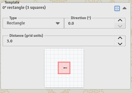
measuredTemplate BlastArea(icon: "fa-solid fa-explosion")The user configures the template's shape and dimensions through the field's UI on the sheet. A "Place Template" button on the field invokes the placement workflow, dropping the configured shape onto the active scene.
Note
A measuredTemplate field's value is a configuration object, not a number or string. Referencing self.MyTemplate in a chat block renders a friendly summary ("0° circle, 5 squares") for the player, but the value won't resolve usefully in numeric or string expressions elsewhere. Use it for placement and chat display; don't try to do math on it.

Die Field
die <ID> - Stores a single die value (d4, d6, d8, d10, d12, d20). Supports die step operations and renders with a die icon.
Example:
die DamageDie(initial: "d6", choices: ["d4", "d6", "d8", "d10", "d12"])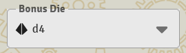
Smart Die Operations: Die fields support intelligent mathematical operations:
self.DamageDie += 1- Steps up to the next die size (d6 → d8)self.DamageDie -= 1- Steps down to the previous die size (d8 → d6)self.DamageDie * 2- Doubles the die size (d4 → d8, d6 → d12)self.DamageDie / 2- Halves the die size (d12 → d6, d8 → d4)
action PowerUp {
    self.DamageDie += 1  // Upgrade from d6 to d8

    chat DieUpgrade {
        "Damage die increased to " + self.DamageDie + "!"
    }
}
Parameters:
initial- Starting die sizechoices- List of allowed die sizes. If not set, defaults to d4, d6, d8, d10, d12, and d20.value- Calculated die value (makes field readonly)
Dice Field
dice <ID> - Stores a number of dice and a die size such as "2d6".
Example:
dice AttackRoll(choices: ["d4", "d6", "d8", "d10", "d12"])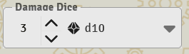
Parameters:
choices- List of allowed die sizes
Document Links / Embeds |
Item List
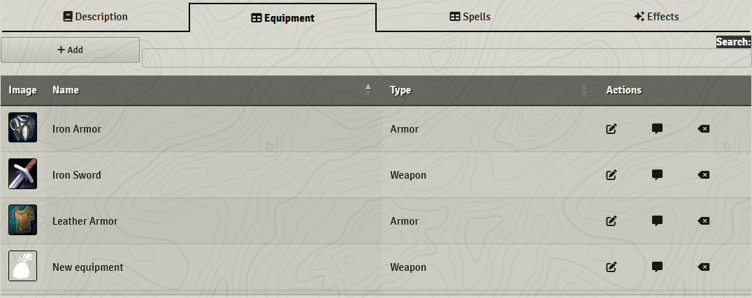
table<ITEM_NAME> <ID> - A list of 0 or more Items of this Document Type that this Actor owns. Only available on Actor documents. This renders as a table with sort, search, and drag functionality on the sheet.
Example:
actor PC {
    table<Equipment> OwnedEquipment
}

item Equipment {
    choice<string> Type(choices: ["Armor", "Weapon"])
}
The list of Items can be filtered on properties using the where parameter. Inside a where: filter, the special name item refers to each item being tested — it's the iteration alias. So item.Type reads the Type field on the current item under consideration. self inside where: still refers to the actor that owns the list, so you can write filters that depend on actor state too:
table<Equipment> Armors(where: item.Type equals "Armor")
table<Equipment> Weapons(where: item.Type equals "Weapon")

// Combine item and self in a filter
table<Spell> CastableSpells(where: item.Level <= self.SpellSlots)
The same item.X alias is used in where: clauses on inventory, table, choice<DocType>, and choices<DocType> — anywhere a list is being filtered.
💡 You can filter on
choicefields. Achoicestores an object ({ value: "Armor", ... }), butwhere:automatically resolves achoice<string>orchoice<damageType>field to its selected value — sowhere: item.Type equals "Armor"matches as expected even thoughTypeis achoice<string>.
Note that fields: takes unquoted field names — fields: [Name, Type, Weight], not fields: ["Name", "Type", "Weight"]. Quoted names are a syntax error.
Clicking a row's image to run an action — imageAction:
imageAction: makes each row's image clickable, running the named action on that item. It's scoped to the image cell only, so it never interferes with the row's other controls (the action buttons, drag-to-reorder, etc.). Hovering the image reveals the action's own icon as an affordance.
The action must be defined on the table's item type:
actor PC {
    // Click a weapon's image to attack with it
    table<Weapon> Weapons(imageAction: Attack)
}

item Weapon {
    number Damage
    action Attack(icon: "fa-solid fa-gavel") {
        fleeting hit = roll(d20)
        chat AttackCard {
            flavor "Attacking with " + self.name
            hit
        }
    }
}
The other table parameters can be combined freely — e.g. table<Weapon> Weapons(where: item.Equipped equals true, fields: [Damage], imageAction: Attack).
Single Item
<ITEM NAME> <ID> - Allows linking to an Item, be it on the same Actor or on another sheet / in the World / in a Compendium. This UX allows dragging an Item to the box to link it.
Example:
Equipment Armor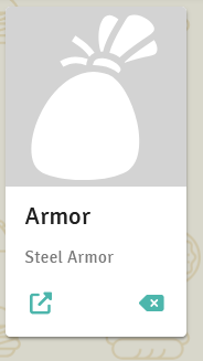
Reference Fields — picking a field at play time
self<type> and parent<type> create picker fields. The user chooses which underlying field this reference points at, and your action code then reads through the picker without caring which field was chosen. This is how you build "pick a stat to roll" mechanics, configurable spell costs, and other patterns where the relevant field varies per item or per character.
What does self.MyRef substitute in an expression?
A reference field resolves exactly the same way the chosen field would resolve if you had written it directly. Same rules, same rounding, same auto-.total behaviour.
| Reference type | What self.MyRef substitutes | Equivalent direct access |
|---|---|---|
self<attribute> | The chosen attribute's mod (its play value) | self.Strength |
self<resource> | The chosen resource's current value | self.HP |
self<tracker> | The chosen tracker's current value | self.Mana |
self<number> | The chosen number's current value | self.AttackBonus |
self<die> | The chosen die size as a die expression (d6, d8, ...) | self.DamageDie |
self<dice> | The chosen dice expression (2d6, 3d8, ...) | self.AttackDice |
self<boolean> | The chosen boolean's current value | self.IsTrained |
self<string> | The chosen string's current value | self.Background |
self<date> / <time> / <datetime> | The chosen field's stored timestamp | self.LastUsed |
self<choice> | The chosen choice field's selected value | self.Class |
self<html> | The chosen HTML field's body | self.Description |
self<paperdoll> | The chosen paperdoll field's data | self.Equipment |
parent<type> works identically, except the picker chooses from fields on the owning actor (so it's only useful inside Items).
To reach the underlying field object (e.g., the chosen attribute's max, or a resource's temp), drill in further: self.MyRef.max, self.MyRef.temp. The first hop resolves to the field; subsequent hops are normal property access.
Parent Property Reference
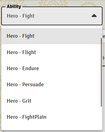
parent<type> <ID> - Allows referencing a field from the parent document (Actor). Useful in Items that need to reference the character's attributes, resources, or any other typed field.
Supported Types:
attribute,resource,tracker,number,boolean,string,date,time,datetime,die,dice,choice,paperdoll,html
Example:
// In an Item document
parent<attribute> AttackAttribute(choices: ["Strength", "Dexterity", "Intelligence"])
parent<resource> Consumes              // e.g. for a spell that drains Mana, Stamina, etc.
parent<die> DamageDie                  // pick one of the parent's die fields
This creates a dropdown of the parent Actor's matching fields that can be selected and referenced in calculations. When the item's logic reads self.AttackAttribute, it resolves to the chosen field's value on the owning actor.
Self Property Reference
self<type> <ID> - Allows dynamically referencing properties within the same document. Perfect for creating configurable fields that can point to different properties on the same character, item, or document.
Supported Types:
attribute,resource,number,boolean,string,date,time,datetime,die,dice,tracker,choice,paperdoll,html
Example:
actor Character {
    // Basic stats
    number Strength(label: "Strength")
    number Dexterity(label: "Dexterity")
    number Intelligence(label: "Intelligence")

    // Dynamic reference to any number field on this character
    self<number> PrimaryAttribute(label: "Primary Attribute")

    // Dynamic reference to any string field
    self<string> DisplayName(label: "Display Name")
}

item Weapon {
    number Damage(label: "Base Damage")
    number CriticalDamage(label: "Critical Damage")
    number MagicDamage(label: "Magic Damage")

    // User chooses which damage value to use as primary
    self<number> PrimaryDamage(label: "Primary Damage Type")
}
User Interface Features:
- Type Filtering - Only shows properties matching the specified type
- Autocomplete Search - Users can type to filter available options
- Live Value Display - Shows current value of referenced property as a chip
- Visual Indicators - Link icon and crosshairs for easy identification
Usage in Expressions: Self property references can be used in roll formulas and actions, and ISDL substitutes the currently chosen field's value automatically:
actor Character {
    number Strength
    number Dexterity
    self<number> PrimaryStat(label: "Primary Stat")

    action PrimaryStatRoll {
        fleeting result = roll(d20 + self.PrimaryStat)
        chat primaryRoll {
            result
        }
    }
}
When PrimaryStat is set to Strength, the roll becomes d20 + Strength. When the user changes it to Dexterity, the same action rolls d20 + Dexterity with no code changes.
Comparison with Parent References:
| Feature | self<type> | parent<type> |
|---|---|---|
| Scope | Same document | Parent document |
| Use Case | Dynamic property selection within document | Reference parent actor's properties |
| Data Source | Current document's properties | Parent document's properties |
Document Choice
choice<DOCUMENT_TYPE> <ID> - Allows selecting a single document from a searchable dropdown instead of drag-and-drop. Better UX for large collections.
Example:
choice<Spell> ChosenSpell(global: true)  // Can select from world/compendiums
choice<Equipment> CurrentWeapon         // Limited to owned items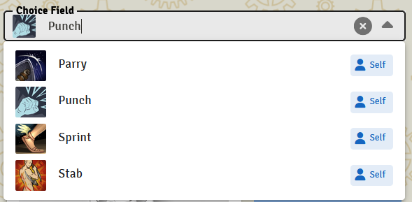
Parameters:
global- If true, any Item in the World can be selected. If false, only items on the Document can be selected.
Document Choices
choices<DOCUMENT_TYPE> <ID> - Allows selecting multiple documents from a searchable dropdown with a configurable maximum limit. Perfect for party members, equipped items, or feature selections.
Example:
choices<Hero> PartyMembers(max: 4)                    // Up to 4 heroes
choices<Equipment> EquippedArmor(max: 3, global: true) // Up to 3 from world
choices<Spell> KnownSpells(max: 8, where: item.Level <= self.Level)
Parameters:
max- Maximum number of selections allowed (required)initial- Initial number of empty slots to showglobal- If true, any Item in the World can be selected. If false, only items on the Document can be selectedwhere- Filter expression to limit which items can be selected
Paper Doll
paperdoll <ID> - Creates an equipment interface overlaid on a character image. Define slots at specific pixel positions and assign item types to them. Players equip items by clicking slots.
Example:
item Equipment {
    choice<string> Slot(choices: ["Head", "Body", "Hands", "Feet"])
    number Weight
}

actor Character {
    paperdoll Loadout(image: "systems/mysystem/img/silhouette.png", size: 60px) {
        Equipment Helmet(left: 100px, top: 10px)
        Equipment Armor(left: 100px, top: 80px)
        Equipment Gloves(left: 50px, top: 120px)
        Equipment Boots(left: 100px, top: 200px)
    }
}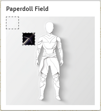
Each slot is positioned using left and top pixel coordinates relative to the background image. When an item is equipped, the slot shows the item's image. Clicking a filled slot opens the item's sheet.
Parameters:
image- Path to the background character image (default:systems/{id}/img/paperdoll_default.png)size- Size of each equipment slot in pixels (e.g.size: 60px). Default:40pxlabel- Custom label for the fieldicon- Icon for the field headercolor- Color themevisibility- Standard visibility control
Slot Syntax: Each slot inside the paperdoll block follows this pattern:
<ItemType> <SlotName>(left: <X>px, top: <Y>px)Position values are pixel offsets from the top-left corner of the background image. Use your image editor to find the coordinates for each slot.
Table Field
table<DOCUMENT_TYPE> <ID> - Creates a customizable data table for displaying structured information. Uses Vuetify DataTables with advanced features like sorting, filtering, and column management.
Example:
table<Equipment> EquipmentTable(fields: [Name, Type, Weight, Value])
table<Spell> SpellBook(where: item.RequiredLevel <= self.Level)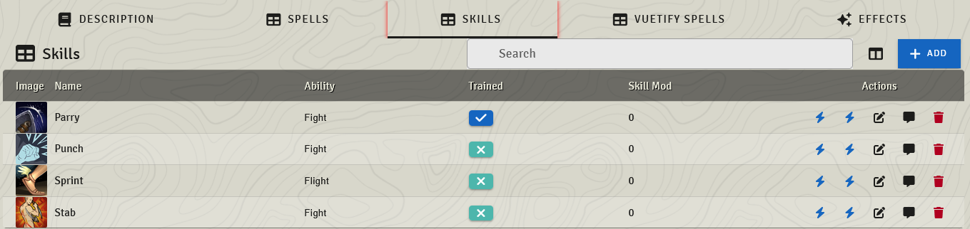
Features:
- Column Management - Users can show/hide columns and reorder them. The Image column is configurable like any other (it can be hidden/reordered via the column dialog), and is shown first by default. The Name column is always shown and can be reordered but not hidden.
- Advanced Filtering - Built-in search and filter capabilities
- Sorting - Click column headers to sort data
- Drag & Drop - Items can be dragged to/from the table
- Responsive Design - Automatically adjusts to screen size
Parameters:
fields- List of field names (bare identifiers, not quoted strings — e.g.[Name, Type, Weight]) to display as columns by default. If not specified, shows all fields. (Users can still toggle any column on/off via the column dialog.)Namealways shows;Imageshows first by default.where- Filter expression to limit which items appear in the tableicon- Icon for the table sectionlabel- Custom label for the tableimage-true/false. Whether the Image column is visible by default (defaulttrue). Setimage: falseto hide it out of the box; users can re-enable it from the column dialog.
// Hide the image column by default
table<Equipment> EquipmentTable(image: false)
Visibility: Tables respect visibility at two independent levels:
- The table itself - A visibility modifier or
visibility:param on the table hides the whole table tab.hiddenremoves it;gmOnly/secretshow the tab only to the GM / GM & owners.kotlingmOnly table<Spell> GMNotes // entire tab is GM-only table<Loot> HiddenLoot(visibility: { return Visibility.hidden }) - Individual columns - Each column inherits the visibility of the field it displays (defined on the embedded document). A field marked
hiddenis dropped from the table entirely;gmOnly/secretfields become columns only the GM / GM & owners can see, and they're hidden from the column dialog for other players too.
Note: Per-column
gmOnly/secretgating works for static visibility (a modifier orVisibility.Xvalue). A column whose visibility is a method block can't be resolved per-row, so it is always shown — don't rely on a method-blockgmOnlyto hide a column from players.
Macro Field
macro <ID> - Stores a Foundry macro that can be executed. Useful for complex actions or frequently used rolls.
Example:
macro QuickHeal(label: "Quick Heal Spell")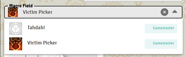
Use with self.MacroName.execute() in actions to run the stored macro.
Inventory Field
inventory<DocumentType> <ID> - Creates a visual grid-based inventory system with drag-and-drop support, perfect for managing equipment, items, and resources in a compact, game-like interface.
Basic Usage:
actor Character {
    inventory<Item> Backpack
}
Advanced Configuration:
actor Character {
    inventory<Equipment> MainInventory(
        rows: 4,
        columns: 6,
        slots: 30,
        slotSize: 50px,
        quantity: Quantity,
        money: Gold,
        sum: [Weight, Value],
        sumMax: self.CarryCapacity,
        sort: Weight asc,
        where: item.Equipped equals false,
        emptySlots: show,
        summary: full
    )
}
Grid Configuration: The inventory displays items in a customizable grid layout:
- Grid Size - Defined by
rows × columns(default: 3 rows × 5 columns = 15 slots) - Maximum Capacity - The
slotsparameter caps total items regardless of grid size - Dynamic Sizing -
slotSizecontrols the pixel dimensions of each slot (default: 60px)
Key Features:
- Drag & Drop - Drag items into inventory from compendiums, other actors, or reorder within the grid
- Visual Display - Shows item images in a grid with quantity badges for stackable items
- Hover Tooltips - Displays item name, description, and relevant statistics on hover
- Click to Open - Click any item to open its sheet for editing
- Delete on Hover - X button appears when hovering over items (in edit mode)
- Empty Slot Management - Show, hide, or collapse empty slots based on preference
- Aggregation Display - Shows totals for item properties (weight, value, etc.) with progress bars
Parameters:
rows- Number of grid rows (default: 3)columns- Number of grid columns (default: 5)slots- Maximum number of items allowed, caps the grid size (default: 20)slotSize- Slot dimensions in pixels (default: 60px)quantity- Reference to item's quantity field for displaying stack countsmoney- Link to a money field to display currency at the bottom of inventorysum- Array of item properties to aggregate (e.g.,[Weight, Value])sumMax- Maximum capacity for aggregated properties (number or expression likeself.CarryCapacity)sort- Property to sort items by, withascordescorderwhere- Filter expression to show/hide items based on conditionsglobal- Include items from compendiums (default: false)emptySlots- Display mode for empty slots:show,hide, orcollapse(default: show)summary- Tooltip detail level:full,compact, orminimal(default: full)icon- Icon for the inventory headerlabel- Custom label for the inventorycolor- Color theme for the inventory
Common Use Cases:
Equipment Bag:
inventory<Equipment> Backpack(
    rows: 3,
    columns: 5,
    slots: 15,
    quantity: Quantity,
    sum: Weight,
    sumMax: self.CarryCapacity
)
Hot Bar:
inventory<Consumable> QuickBar(
    rows: 1,
    columns: 10,
    slotSize: 50px,
    emptySlots: show
)
Filtered Storage:
inventory<Item> EquippedGear(
    where: item.Equipped equals true,
    rows: 2,
    columns: 4
)
Integration with Actions: Items in inventory maintain their custom actions. Click an item to open its sheet and access all available actions.
Notes:
- Inventory grids automatically cap at the
slotsmaximum, even ifrows × columnsis larger - The first empty slot shows a "+" icon for quickly creating new items
- Items can be dragged from inventory to other character sheets, compendiums, or the world
- Duplicate prevention: dropping an item back into its own inventory won't create a duplicate
Pinned Field
pinned <ID> - Creates an interactive data table that displays all items the user has marked as "pinned" on the actor.
How items get pinned. Each item table on the actor sheet (the table that an Item[] field generates, the inventory<...> field, etc.) renders a Pin toggle next to each row. Users click the pin icon to toggle pinning on or off for that item. This is a built-in UX, not something you wire up. The pinned field on the actor doesn't cause items to become pinned — it controls where the pinned-items list renders on the sheet.
Example:
actor Character {
    pinned FavoriteItems(icon: "fa-solid fa-thumbtack", label: "Favorite Items")
}
The pinned field creates a searchable, sortable table showing:
- Pin Toggle - Unpin items from the collection
- Item Image - Visual representation of each item
- Item Name - With description on hover
- Item Type - Displayed as a chip
- Actions - All available actions for that item type
Key Features:
- Type-Specific Actions - Each item displays only the actions defined for its document type
- Standard Actions - Edit, Send to Chat, Delete are always available
- Interactive Interface - Search, pin/unpin, and execute actions directly from the table
- Always Active - Remains interactive regardless of edit mode
- Empty State - Shows helpful guidance when no items are pinned
Usage Pattern: Items are pinned by users from inventory tables or item sheets. The pinned field provides quick access to frequently used items without navigating through multiple tabs.
Parameters:
icon- Icon for the field header (default: "fa-solid fa-thumbtack")label- Custom label for the fieldcolor- Color theme for the pin icons
Visibility: Like tables, a visibility modifier or visibility: param hides the whole pinned tab — gmOnly pinned GMFavorites shows the tab only to the GM, hidden removes it entirely.
Integration with Actions: If you define custom actions on item types, they automatically appear in the pinned field for items of that type:
item Weapon {
    action QuickAttack(icon: "fa-solid fa-sword", color: "red") {
        // Custom attack logic
    }
}

item Spell {
    action CastSpell(icon: "fa-solid fa-magic", color: "blue") {
        // Custom spell casting logic
    }
}

actor Character {
    pinned FavoriteItems
}
When a weapon is pinned, it shows the QuickAttack button. When a spell is pinned, it shows the CastSpell button. This creates a dynamic, context-aware action bar for your most important items.
Bonuses
bonuses <ID> - Displays a read-only summary table showing all damage type bonuses on this document. Works with choice<damageType> fields — when you define damage types, the system auto-generates Active Effects fields for each type. The bonuses field collects and displays those values.
Example:
actor Character {
    choice<damageType> DamageTypes(choices: [
        { value: "Slashing", color: "#C0C0C0", icon: "fa-solid fa-sword" },
        { value: "Fire", color: "#FF4500", icon: "fa-solid fa-fire" },
        { value: "Ice", color: "#87CEEB", icon: "fa-solid fa-snowflake" }
    ])

    bonuses DamageBonuses(label: "Damage Bonuses", icon: "fa-solid fa-plus")
}
The table shows each damage type with its icon and color, alongside the current bonus value. Positive values appear in green, negative in red, and zero in grey.
Parameters:
label- Custom label for the fieldicon- Icon for the field headercolor- Color themevisibility- Standard visibility control
Resistances
resistances <ID> - Displays a read-only summary table showing all damage type resistances on this document. Shows both flat damage reduction and percentage-based resistance for each type. Works with choice<damageType> fields.
Example:
actor Character {
    choice<damageType> DamageTypes(choices: [
        { value: "Slashing", color: "#C0C0C0", icon: "fa-solid fa-sword" },
        { value: "Fire", color: "#FF4500", icon: "fa-solid fa-fire" }
    ])

    resistances DamageResistances(label: "Damage Resistances", icon: "fa-solid fa-shield")
}
The table shows three columns per damage type: the type name (with icon and color), flat resistance value, and percentage resistance value. Non-zero values are highlighted in blue.
Parameters:
label- Custom label for the fieldicon- Icon for the field headercolor- Color themevisibility- Standard visibility control
Roll Visualizer
rollVisualizer <ID>(value: <roll expression>) - A read-only display field that charts the probability distribution of a dice formula, along with its average (expected value) and min/max range. Use it to preview what a roll actually produces — "what damage should I expect from 2d6 + Strength?" — directly on the sheet.
The value: parameter uses the same roll-expression syntax as an attribute's roll:, so it can reference other fields. On a document sheet the chart recomputes live whenever a referenced field changes.
Example:
actor Hero {
    attribute Strength(min: 0, max: 20)
    number WeaponBonus

    rollVisualizer DamagePreview(value: 2d6 + self.Strength + self.WeaponBonus, label: "Expected Damage")
}
How it computes:
- For additive formulas (dice plus constants, using
+/-), ISDL computes the exact distribution by convolution — instant and precise, with no sampling noise. The average is shown as an exact number. - For anything more exotic (keep-highest/lowest like
2d20kh1, exploding dice, rerolls, multiplied dice, etc.), it falls back to Monte Carlo simulation. The average is then an estimate and is prefixed with≈, with the simulation count shown.
Parameters:
value:(required) - The dice expression to visualize. May reference other fields.label- Custom label for the fieldicon- Icon for the field headercolor- Accent color for the chart and averagevisibility- Standard visibility control
Inside a prompt: A rollVisualizer can be placed inside a prompt to preview a roll before the user commits to it. Use input.X to reference the prompt's own input fields — the chart updates live as the user edits them. self.X still refers to the rolling document, so you can mix both. input.X works with number, die, and dice inputs, letting the player build a roll and watch the odds change:
action RollBuilder {
    fleeting build = prompt(label: "Roll Builder") {
        dice DamageDice          // a pool, e.g. 2d6
        die BonusDie             // a single die, e.g. d8
        number FlatBonus
        // Live "2d6 + d8 + 3" preview; updates as any input changes.
        rollVisualizer Preview(value: input.DamageDice + input.BonusDie + input.FlatBonus, label: "Expected Result")
    }
}input.X— a sibling prompt input (live/reactive); supportsnumber,die, anddicefields.self.X— a field on the rolling document.
input.is only valid inside a prompt, and currently only inside arollVisualizer'svalue:.
Damage Track
damageTrack <ID>(max: <NUMBER>, types: [<STRING>, ...]) - A World of Darkness–style damage track. The total number of boxes equals max. Damage fills boxes from least severe to most severe; healed boxes return to empty. Boxes are ordered on screen from most severe (left) to least severe, then empty.
Interaction:
- Left-click an empty box → fills it with the least-severe damage type
- Left-click a filled box → upgrades it to the next more-severe type (if one exists)
- Right-click any filled box → heals it back to empty
Example — classic WoD health track:
actor Character {
    damageTrack Health(max: 7, types: ["bashing", "lethal", "aggravated"])
}
Example — two-tier track:
actor Soldier {
    damageTrack Wounds(max: 10, types: ["scratch", "wound"])
}
Data model: Each type gets its own NumberField, plus an empty field for unfilled boxes. The sum of all buckets always equals max.
system.health.empty      // unfilled boxes
system.health.bashing    // least severe
system.health.lethal
system.health.aggravated // most severe
You can read and write these in actions:
action HealBashing {
    if (self.Health.bashing > 0) {
        self.Health.bashing--
        self.Health.empty++
    }
}

action TakeLethal {
    if (self.Health.empty > 0) {
        self.Health.lethal++
        self.Health.empty--
    }
}
Visual: Each severity level gets a distinct color and symbol:
- Least severe:
\(light blue) - Second:
/(red) - Most severe:
X(purple) - Empty: outlined box
A legend below the boxes shows the symbol and name for each type.
Parameters:
max- Total number of boxes on the tracktypes- Ordered list of damage type names, from least to most severelabel- Custom labelcolor- Primary colorvisibility- Standard visibility control