Defines a Document type — the kind of thing characters or items in your system are. Each Document you declare here produces a character sheet (or item sheet), the underlying data fields Foundry needs to store its values, and all the wiring in between.
Note
"Document" is Foundry's word for "thing that has a sheet and gets saved to the world." Actors and Items are Documents. You'll see this term in Foundry's own docs too.
Available Types: actor, item
Syntax: actor <ID> { <CHILDREN> }
Syntax: item <ID> { <CHILDREN> }
Document Parameters
Both actor and item declarations accept optional parameters in (...) after the document ID:
actor Hero(icon: "fa-solid fa-shield", background: bricks, default: true) { ... }

item Spell(svg: "icons/svg/magic.svg", description: "A magical effect", creatable: true) { ... }| Parameter | Value type | Purpose |
|---|---|---|
icon: | string (Font Awesome class) | Icon shown next to the document type in Foundry UI. |
svg: | string (path) | SVG image used as the document type icon. Use this or icon:. |
background: | named background | Visual background applied to the sheet. See the Page section below for the list of named backgrounds. |
description: | string | Short description shown when creating new instances of this document type. |
creatable: | boolean | If false, users cannot create new instances of this type from the UI (e.g., for abstract base types or NPC-only documents that must be cloned from a template). Default: true. |
default: | boolean | If true, this document type is the default selected when creating a new actor or item. Only one type per kind (actor / item) should be marked default. |
width: | integer or auto | Default width (in pixels) of the sheet window when first opened. Defaults to 1200 for actors, 1050 for items. Users can still resize. |
height: | integer or auto | Default height (in pixels) of the sheet window when first opened. Defaults to 950 for actors, 875 for items. Use auto to size to content. |
zoom: | integer (percentage) | Scale the sheet's contents. zoom: 125 renders the sheet at 125% size. Useful for compact sheets or high-density layouts. Default: 100 (no scaling). |
// Open this NPC's sheet at 900x700, scaled up 25%
actor NPC(icon: "fa-solid fa-ghost", width: 900, height: 700, zoom: 125) { ... }
Naming Conventions
ISDL is forgiving about identifiers, but the wiki uses a single convention everywhere. Following it makes your system easier to maintain and copy snippets from the wiki cleanly:
- Document, field, action, and section IDs use PascalCase:
Hero,HP,RollAttack,MyLoot. Spaces and punctuation are not allowed. - In your ISDL source you always reference fields by their ID with that exact casing:
self.HP,self.RollAttack,parent.Mana. - Generated system paths are lowercase, because Foundry's data layer is lowercase. You'll see this in macros and in Active Effect targets — for example, the field
HPwrites tosystem.hp, and the actionRollAttackwould be referenced in a macro path assystem.rollattack. Inside ISDL itself, you don't write these lowercase paths —self.HPdoes the right thing automatically.
If you want to display a field's name to the player differently than its ID (e.g. ID HP displayed as "Hit Points"), use the label: parameter. The ID stays PascalCase; the label can be anything.
resource HP(label: "Hit Points")Children
Page
Syntax: page <ID> { <DOCUMENT_CHILDREN> }
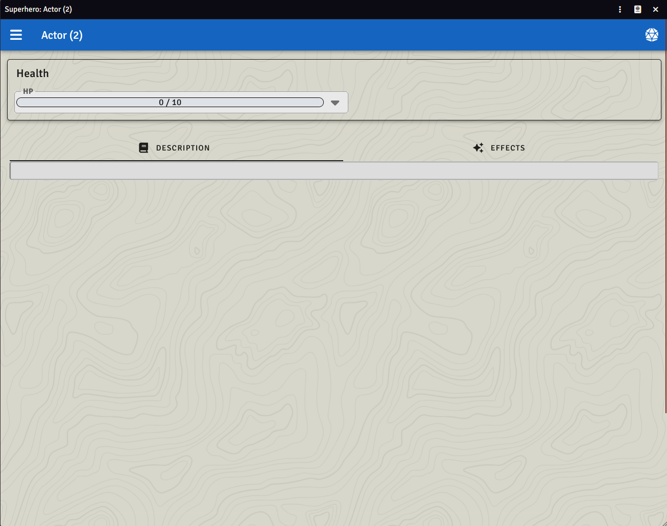
Allows you to nest related sections, properties, and actions together on their own page. Nests visually on a sheet, but not in the datamodel. The pagename is rendered on the sheet as a tab. A default page of the name of the document type will always be created and house description and effects. Any top-level sections & properties will end up on this page as well.
Example:
actor Superhero {
    page Alias {
        string SuperheroName
    }

    page Info(background: hideout) {
        choice<string> Type(choices: ["A", "B", "C"])
        string Summary

        html Background

        section Level {
            number Experience
            number Level(min: 1, max: 10)

            action LevelUp(visibility: {
                if (self.Experience < 10) return Visibility.locked
            }) {
                self.Experience -= 10
                self.Level += 1
            }
        }
    }

    page Stats(icon: "fa-solid fa-chart-line", background: bricks) {
        section Attributes {
            attribute Fight(min: 1, max: 30, mod: {
                return (self.Fight - 10) / 2
            })
            attribute Flight(min: 1, max: 30, mod: {
                return (self.Flight - 10) / 2
            })
        }

        section StatusEffects {
            boolean Slowed
            boolean Dazed
        }
    }

    // Will show up on the base page
    section Health {
        resource HP(max: {
            return self.Fight + 6
        })
    }
}
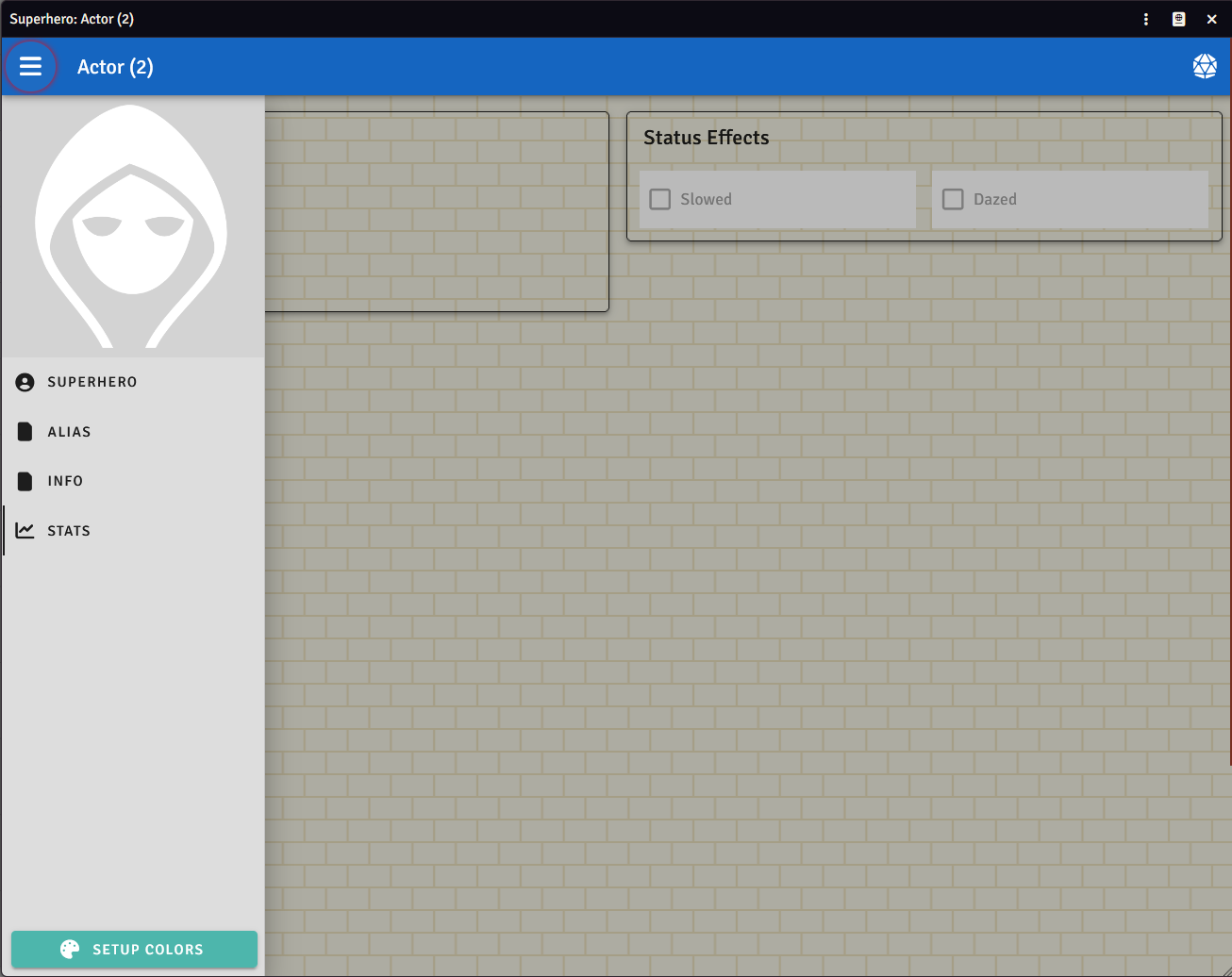
As shown in the examples above, pages support both icon and background as options. The following backgrounds are available from https://heropatterns.com:
- topography (default)
- hideout
- graphpaper
- texture
- squares
- dominoes
- temple
- food
- anchors
- bubbles
- diamonds
- circuitboard
- bricks
- signal
Section
Syntax: section <ID> { <DOCUMENT_CHILDREN> }
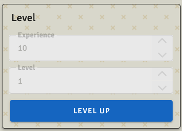
Allows you to nest related properties and actions together. Nests visually on a sheet, but not in the datamodel. The section name is rendered on the sheet.
Example:
section Level {
    number Experience
    number Level

    action LevelUp(visibility: {
        if (self.Experience < 10) return Visibility.locked
    }) {
        self.Experience -= 10
        self.Level += 1
    }
}
Row
Syntax: row { <CHILDREN> }
Places its children side-by-side in a horizontal layout. Use rows to group fields that belong together visually — like putting attribute scores across the sheet instead of stacked vertically.
Example:
actor Character {
    row {
        attribute Strength(mod: { return (self.Strength - 10) / 2 })
        attribute Dexterity(mod: { return (self.Dexterity - 10) / 2 })
        attribute Constitution(mod: { return (self.Constitution - 10) / 2 })
    }
    row {
        attribute Intelligence(mod: { return (self.Intelligence - 10) / 2 })
        attribute Wisdom(mod: { return (self.Wisdom - 10) / 2 })
        attribute Charisma(mod: { return (self.Charisma - 10) / 2 })
    }
}
Rows can be nested inside pages, sections, and columns.
Column
Syntax: column { <CHILDREN> }
Places its children in a vertical stack. On its own this is the default behavior, but columns become useful inside a row to create multi-column layouts.
Example — two-column layout:
actor Character {
    row {
        column {
            number Strength
            number Dexterity
            number Constitution
        }
        column {
            number Intelligence
            number Wisdom
            number Charisma
        }
    }
}
Rows and columns can be freely nested to create any grid layout you need.
Documents, pages, and sections can all contain different types of content:
Content Types
Fields
Documents can contain various field types for data storage:
- Fields - Complete reference for all available field types
Logic and Interactivity
Add calculations, actions, and automation:
- Basic Logic - Variables, math, conditions, and simple actions
- Advanced Logic - Functions, loops, and complex automation
- Interactivity - User prompts, event handlers, and system integration
Quick References
- Logic Reference - Complete syntax reference
- Recipes - Copy-paste solutions for typical RPG mechanics
Full Example
actor Hero {
    section Level {
        number Experience
        number Level

        action LevelUp(visibility: {
            if (self.Experience < 10) return Visibility.locked
        }) {
            self.Experience -= 10
            self.Level += 1
        }
    }

    section Attributes {
        number Dexterity
        number Insight
        number Might
        number Willpower
        attribute Strength(min: 1, max: 30, mod: {
            return (self.Strength - 10) / 2
        })
    }

    section Health {
        resource HP
        resource MP
        number Warrior
        resource Fate(max: {
            return self.Warrior + 6
        })
        readonly number Crisis
    }

    hidden number AvailableSkillLevels
}
Combat
Initiative
Syntax: initiative(value: <EXPRESSION>)
Sets the formula used to determine turn order in Foundry VTT's combat tracker. The expression can reference any property on the actor and include dice rolls.
Example:
actor Character {
    attribute Dexterity(mod: { return (self.Dexterity - 10) / 2 })

    initiative(value: self.Dexterity.mod + roll(d20))
}
The initiative formula is evaluated when combat begins. The result determines the actor's position in the turn order.
Common patterns:
// Simple attribute-based
initiative(value: self.Speed)

// Attribute modifier + dice
initiative(value: self.Dexterity.mod + roll(d20))

// Multiple modifiers
initiative(value: self.Reflexes + self.Awareness + roll(d10))
Only actors can have initiative — items do not participate in combat.